The Importance of a Single Silo for Financial Data Analysis and Reporting
Data is a piece of information which captures the state that a business, a process, or a person finds themselves in at a given point in time. Although data by its nature is backward-looking, it has consequences that shape the future.
Even the quickly moving red and green stock prices, which are considered to provide “real-time” information about what is going on in the equities market is backward-looking: by the time we see the price change up or down, the information has already been digested by investors.
However, nobody would say that the data that we get from the stock market does not have consequences for the future: it affects a wide range of aspects in our society, from real wealth to policy decisions.
As such, when we think about financial data, we think about information which tells about the state of an organization’s financial health at a point in time, but with serious implications for the months and years to come.
For sophisticated allocators, such as a family offices, the words “financial data” encompass all the critical information about their cash flows, their income and costs, the balance between their assets and liabilities, and their asset allocations and trading activity.
Without the proper tools, storing, analyzing, and clearly presenting all this information can be a real challenge for investors. In other words, without the right tools, investors cannot know where their money is.
On one hand, the organization needs to ensure the quality and security of the data in question. On the other hand, the investor must have the right financial reporting tools which enable accurate and clear presentation of complex financial data. Let’s take the first issue and explore it further.
The Data Silo Challenge: Ensuring the Quality and Safety of Financial Data
Across the institutional investor landscape, a solid data management framework is often hindered by the development of data silos. These are collections of information that are isolated from other data within the organization.
Having these isolated pockets of information is akin to bad communication between various teams or different departments: without proper communication, things either don’t get done or they are done mistakenly.
It is a similar story when it comes to data: if there is not a harmonious link between all the information flow across the whole organization, this can make it very difficult to share data between different teams, departments, and projects, to get a holistic view of the data, and to make better informed decisions about the overall direction of the business.
There is new research that points out that financial data should be viewed as an asset in itself. Data silos prevent institutional allocators from maximizing the value of this internal asset. But what causes data silos? In a recent blog we provided four reasons for why they can develop:
- Incompatible data formats.
- Lack of communication between departments.
- Legacy IT systems.
- Lack of data governance.
These developments can result in all sorts of challenges, such as weaker collaboration and data sharing, inaccurate and outdated data, and even an increased likelihood of data breaches. How can investors prevent these issues from materializing and thus avoiding the development of data silos?
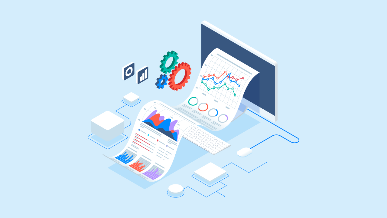
The solution lies in the right tool which helps centralize financial data. This helps to reduce or to remove data silos. Having a single silo across the organization for financial data analysis and reporting has a range of benefits. These include:
- Enhanced accuracy and timeliness of reporting.
- Better decision-making across the organization.
- Improved client service.
- Reduced costs associated with maintaining multiple data systems.
However, ensuring the quality and safety of the data, which is what the single silo solution is designed to do, is only solving part of the initial challenge which we mentioned. The other half of the issue is how to present financial data in a way that ensures it is clear and accurate.
Data Presentation: Telling the Right Story in a Clear and Accurate Manner
When it comes to understanding financial data deeply, so that actionable insights can be based on it, presentation is everything. The right presentation which displays complex data clearly, accurately and in an engaging manner is akin to good communication. This is true regardless of whether the financial data in question is presented internally, say to a risk management meeting, or it is sent externally to clients or regulators.
As we argued in a previous post, data storytelling is an art more than it is a science. This sounds counterintuitive since we are working here with quantifiable information. However, even the best data available is useless if it is not displayed in the right manner. But what does “the right manner” mean here? Nothing more and nothing less than making financial data easier to visualize, analyze, and share.
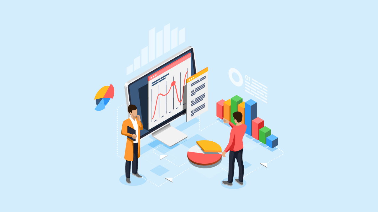
There are several things to consider here. First is the type of chart which best fits the information in question. Pie charts, bar charts, scatter plot, and line charts (to name a few) serve different purposes when it comes to data storytelling.
A pie chart is great for highlighting how a part of the data fits within a whole. Bar charts are wonderful at displaying changes in growth over time. Line charts are better at highlighting the overall direction of a trend within the data itself. Scatter plot charts demonstrate the relationship between two variables, which is a handy tool when you want to present the correlation between data points.
Having these isolated pockets of information is akin to bad communication between various teams or different departments
Choosing the right chart (or charts) is only the first step. Everything else matters equally: the resolution, the size, and even the colors. All of these elements have an important impact on those who engage with the data.
The wrong resolution can put off the user as the presentation may seem unprofessional. The wrong size can make it difficult to visualize and analyze the information. The wrong colors can tell the completely wrong story all together. These things hold true for tables as well. A well designed table that contains the right information can make a huge positive difference in how the investor develops their own data storytelling journey.
There are a variety of data visualization tools available to investors, such as charting software, data visualization software, and business intelligence (BI) software. The FundCount solution for data presentation and analysis is designed to help investors to tell a persuasive story that inspires and educates their target audience.